Research have found that brand recognition can be significantly increased by up to 80% through effective use of branding colours. Brand colour themes should be strategically chosen as each colour leaves a subconscious impression on consumers based on their underlying colour psychology. So, what do the colours mean?
RED
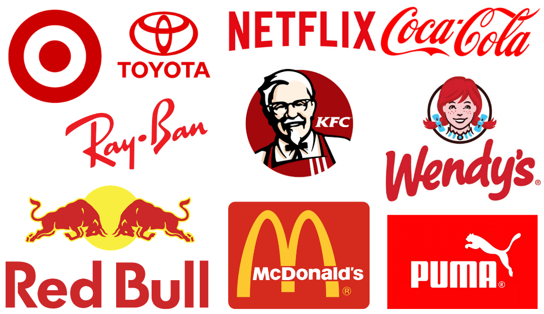
Ever wondered why most fast food logos include the use of red? Red colour increases the heart rate and triggers stimulation; therefore, it attracts attention, and influences your appetite. It is a strong colour that represents powerful emotions, both in positive (power, passion, energy) and negative contexts (warning, danger, anger).
ORANGE
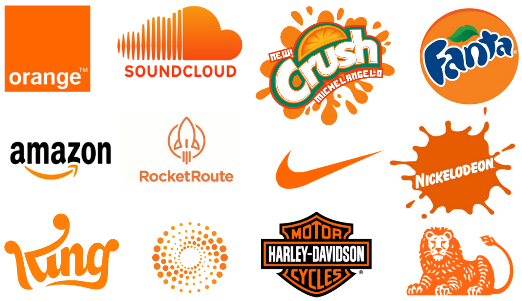
Orange is a youthful colour that creates a feeling of warmth associated with the sun. Lighter orange shades create more fun associations whilst darker autumn orange shades create earthy branding associations. The colour is often associated with affordable products.
YELLOW
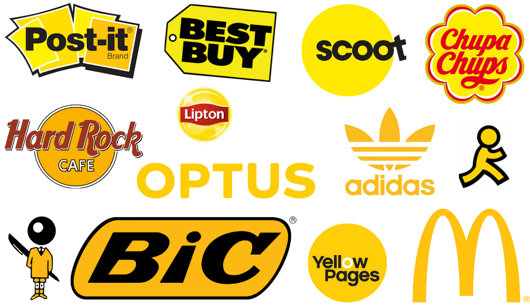
Yellow, the colour of sunshine is associated with optimism, happiness and fun. It is yet another youthful colour that is associated with affordable products or brands.
GREEN

Green is considered the opposite to red in the world of brand psychology. The colour is associated with nature, health, and relaxation. It turns from the concept of quick bites from fast food stores that red promotes and brings the comfort and relaxation you’d expect from the experience of sipping a lingering coffee at Starbucks.
BLUE

Much like the calming effects of the blue ocean, the colour blue has a comforting effect on the mind. It is considered a colour that represents trustworthiness, loyalty, security, and wisdom. The colour has the opposite influence on the appetite as opposed to red, causing a suppression of the appetite.
PURPLE
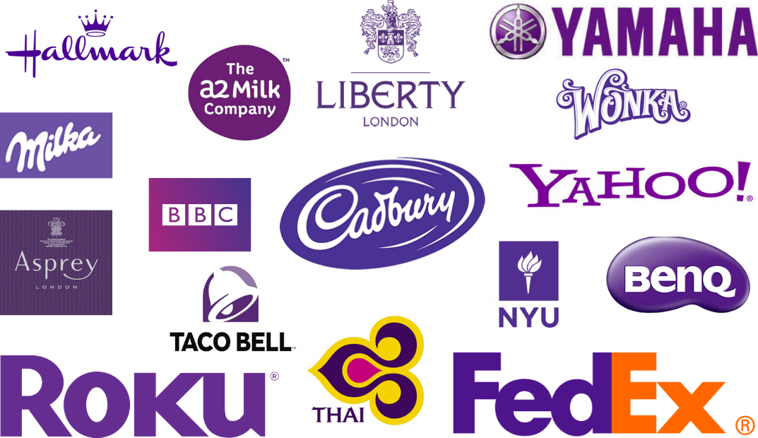
Traditionally purple has been a colour of royalty and luxury, as the price of purple die was very expensive and only the wealth could afford to be associated with such a colour. The although it is considered a rather moody colour, it is often associated with quality and wisdom.
PINK
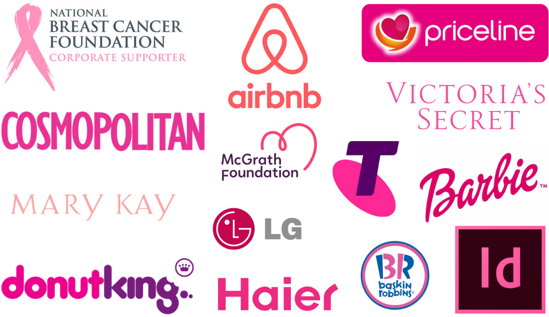
It is commonly known that the colour pink is a very feminine colour. However, brands have also been able to use this colour to represent sensitivity, romance, playfulness and youthfulness. Pink can be used to soften and add youthfulness to a formal or corporate brand.
BLACK
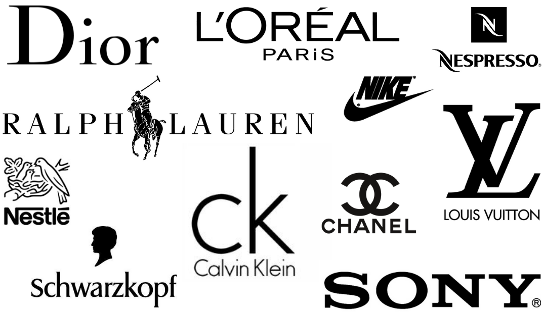
Black is a powerful colour used to represent sophistication, elegance, and luxury. Being associated with many high-end brands, the colour black can also be considered intimidating and unapproachable.
WHITE
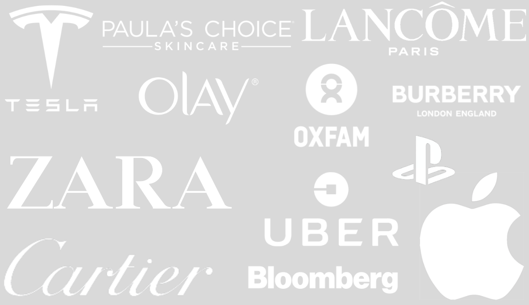
White creates the aesthetics of minimalism and is often associated with purity, cleanliness and innocence. It although it can create a modern appeal, it can also be potentially associated with sterility.
GREY

The mature colour of grey provides the associations of formality, professionalism and dependability. On the flip side of this, it can be considered a conservative colour that lacks emotions.
METALLICS
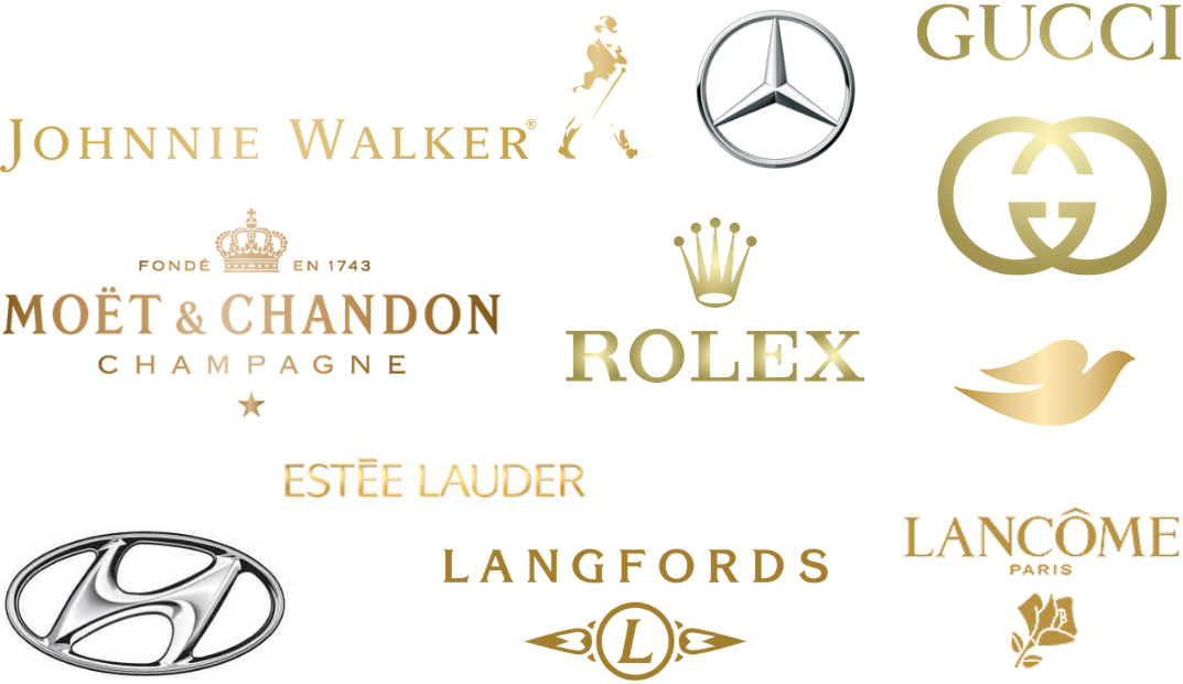
Silver and gold are associated with expensive jewellery, so it is no surprise that metallic colours are often associated with luxury, wealth and prosperity. The use of gold can be associated with success, much like the use of gold medals for first place winners. On the other hand, silver as a more modern and graceful association.